简介
easyui 是一种基于 jQuery 的用户界面插件集合。
easyui 为创建现代化,互动,JavaScript 应用程序,提供必要的功能。
使用 easyui 你不需要写很多代码,你只需要通过编写一些简单 HTML 标记,就可以定义用户界面。
easyui 是个完美支持 HTML5 网页的完整框架。
easyui 节省您网页开发的时间和规模。
easyui 很简单但功能强大的。
官网地址:http://www.jeasyui.com/index.php
文档地址:
快速入门 弹出对话框 demo
第一步: 下载 Jquery EasyUI
你在使用和进行开发时,请遵守官方相应的条款,尊重他们的知识版权。
目前官方最新版本是:jQuery EasyUI 1.5,官方提供了两个版本供下载,GPL 版本和商业版本,你根据自己的需要下载
- GPL 版本 GPL 版本在 GPl 协议下有效,你能在任何遵循 GPl 协议的项目下使用它。
- 商业版本 商业版在 Commercial 协议下有效,你能在任何非 GPL/专有的协议下使用。
第二步:创建 html 文件,并添加相关引用
创建项目的文件夹
easydemo                            // 项目根目录
├── index.html                      // 我们的测试页面
└── lib                             // 第三方组件
    └── jquery-easyui-1.5.5.2       // 下载的easyui的压缩包解压后的文件夹
        ├── easyloader.js           // easyui的动态加载组件的js
        ├── jquery.easyui.min.js    // 压缩后的包!!!关键!!
        ├── jquery.easyui.mobile.js
        ├── jquery.min.js           // 依赖的jq的文件
        ├── locale                  // 本地语言的文件夹
        ├── plugins                 // 拆分的组件
        └── themes                  // 样式主题文件夹
第三步: 修改 index.html 文件
<!DOCTYPE html>
<html lang="en">
<head>
<meta charset="UTF-8">
<meta name="viewport" content="width=device-width, initial-scale=1.0">
<meta http-equiv="X-UA-Compatible" content="ie=edge">
<!-- easyui的样式,可以选择其他主题 -->
<link rel="stylesheet" href="./lib/jquery-easyui-1.5.5.2/themes/bootstrap/easyui.css">
<!-- easyui的图标css文件 -->
<link rel="stylesheet" href="./lib/jquery-easyui-1.5.5.2/themes/icon.css">
<!-- easyui 依赖jq -->
<script src="./lib/jquery-easyui-1.5.5.2/jquery.min.js"></script>
<!-- jq easyui的js脚本 -->
<script src="./lib/jquery-easyui-1.5.5.2/jquery.easyui.min.js"></script>
<!-- 引用语言包 -->
<script src="./lib/jquery-easyui-1.5.5.2/locale/easyui-lang-zh_CN.js"></script>
<title>AICODER jQuery EasyUI Demos</title>
</head>
<body>
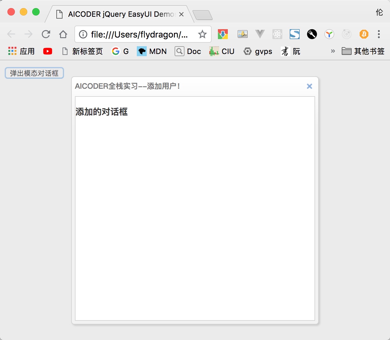
<!-- 功能:点击按钮弹出模态对话框 -->
<input type="button" value="弹出模态对话框" id="btnOpenDialog">
<!-- 设置弹出来的对话框div,首先设置为隐藏 -->
<div id="addDialog" style="display: none;">
<h3>添加的对话框</h3>
</div>
<script>
$(function () {
$('#btnOpenDialog').on('click', function () {
// 弹出对话框
$('#addDialog').dialog({
modal: true, // 是否是模态对话框
title: 'AICODER全栈实习--添加用户!', // 弹出来的窗口的标题
width: 400, // 窗口的宽度
height: 400, // 窗口的高度
});
});
});
</script>
</body>
</html>
结果如下:
easyui 的布局
jq easyui 把网页分成了 上、下、左、中、右,分别对应:North、South、West、Center、East。
easyui 增加了自定义的属性:data-options,通过它可以设置 easyui 组件的选项。
<body class="easyui-layout">
  <div data-options="region:'north',split:true" style="height:100px;"></div>
  <div data-options="region:'south',split:true" style="height:100px;"></div>
  <div data-options="region:'east',title:'East',split:true" style="width:100px;"></div>
  <div data-options="region:'west',title:'West',split:true" style="width:100px;"></div>
  <div data-options="region:'center',title:'center title'" style="padding:5px;background:#eee;">
    <input type="button" value="弹出模态对话框" id="btnOpenDialog">
  </div>
</body>
布局区域选项说明
| 选项 | 类型 | 说明 | 默认值 |
|---|---|---|---|
| region | String | 所处的方位,可取值:North、South、West、Center、East | null |
| title | String | 区域的标题 | null |
| split | Boolean | 是否跟其他区域进行分离(增加外边距) | false |
| href | String | 从后台获取 html,并显示在此区域 | null |
| collapsible | Boolean | 是否显示可折叠按钮 | true |
| iconCls | string | An icon CSS class to show a icon on panel header. | null |
| minWidth | Number | 区域的最小宽度 | 10 |
| minHeight | Number | 区域的最小高度 | 10 |
| maxWidth | Number | 区域的最大宽度 | 10000 |
| maxHeight | Number | 区域的最大高度 | 10000 |
布局的方法
| 方法名 | 参数 | 描述 |
|---|---|---|
| resize | param | 改变布局的大小. 参数 param 对象可以设置以下属性: width: 布局的宽度. height: 布局的高度. |
| collapse | region | 折叠区域, region 参数可以取值:north,south,east,west. |
| expand | region | 展开区域面板, region 参数可以取值:north,south,east,west. |
| add | options | 添加一个面板 |
| remove | region | 移除一个区域面板, 参数 region 可以取值:north,south,east,west. |
| split | region | 移除区域 参数 region 可以取值:north,south,east,west |
| unsplit | region | 取消移除区域 参数 region 可以取值:north,south,east,west |
例如:
// 改变大小
$('#cc').layout('resize', {
  width: '80%',
  height: 300
});
// 折叠区域
$('#btnCloseEast').click(function () {
  $(document.body).layout('collapse', 'east');
});
// 展开区域
$('#btnExpandEast').click(function () {
  $(document.body).layout('expand', 'east');
});
布局的事件
| 事件名 | 参数 | 描述 |
|---|---|---|
| onCollapse | region | 当折叠区域的时候触发 |
| onExpand | region | 当展开区域的时候触发 |
| onAdd | region | 当添加区域的时候触发 |
| onRemove | region | 当移除区域的时候触发 |
// 注册监听事件
$(document.body).layout({
  onCollapse: function (region) {
    $.messager.alert('消息标题', '消息内容:折叠了面板:' + region, 'info');
  },
  onExpand: function (region) {
    $.messager.alert('消息标题', '消息内容:展开了面板:' + region, 'warning');
  }
});
easyui 的消息组件
easyui提供了丰富的弹出消息框的方法。
弹出消息框
$.messager.alert 方法提供了弹出消息的功能,类似window.alert的功能。
此方法接受的参数:
| 参数名 | 说明 |
|---|---|
| title | 显示消息框的标题 |
| msg | 消息内容. |
| icon | 消息的内容前面的图标,可以用图标名为: error,question,info,warning. |
| fn | 点击ok按钮后的回调函数 |
两种调用模式
// 第一种: 传入三个字符串参数
$.messager.alert('My Title','Here is a info message!','info');
// 第二种: 传入对象参数
$.messager.alert({
  title: 'My Title',
  msg: 'Here is a message!',
  fn: function(){
    //...
  }
});
弹出确认对话框
$.messager.confirm 方法提供了弹出消息的功能,类似window.confirm的功能。
此方法接受的参数:
| 参数名 | 说明 |
|---|---|
| title | 显示消息框的标题 |
| msg | 消息内容. |
| fn | 点击ok按钮后的回调函数 |
两种调用模式
// 第一种: 传入三个字符串参数
$.messager.confirm('Confirm', 'Are you sure to exit this system?', function(r){
  if (r){ // 如果用户点击确认,那么  r就是true,否则fals
    // exit action;
  }
});
// 第二种: 传入对象参数
$.messager.confirm({
  title: 'My Title',
  msg: 'Are you confirm this?',
  fn: function(r){
    if (r){  // 如果用户点击确认,那么  r就是true,否则fals
      alert('confirmed: '+r);
    }
  }
});
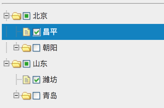
easyui 的树组件
easyui 树形菜单(Tree)也可以定义在 <ul> 元素中。
初始化树有两种方式:
通过标签初始化
通过js初始化
以下是通过js初始化的案例
$('#tt').tree({
  checkbox: true, // 是否显示多选框
  data: [{
    id: 1,
    text: '北京',
    state: 'open',
    attributes: {
      url: "/demo/book/abc",
      price: 100
    },
    children: [{
      id: 7,
      text: "昌平",
      checked: true
    }, {
      id: 8,
      text: "朝阳",
      state: "closed"
    }]
  }, {
    id: 2,
    text: '山东',
    state: 'open',
    attributes: {
      url: "/demo/book/abc",
      price: 100
    },
    children: [{
      id: 9,
      text: "潍坊",
      checked: true
    }, {
      id: 10,
      text: "青岛",
      state: "closed"
    }]
  },],
  animate: true,  // 节点折叠和展开是否使用动画
  lines: true, // 是否显示 节点之间的线条
  dnd: true, // 是否可拖拽
});
结果:
easyui 表格组件
表格是easyui里面使用最广的组件。
DataGrid 数据表格,扩展自 $.fn.panel.defaults ,用 $.fn.datagrid.defaults 重写了 defaults 。
依赖
- panel
- resizable
- linkbutton
- pagination
用法
<table id="tt"></table>
<script>
$('#tt').datagrid({
   url:'datagrid_data.json',
   columns:[[
     {field:'code',title:'Code',width:100},
     {field:'name',title:'Name',width:100},
     {field:'price',title:'Price',width:100,align:'right'}
   ]]
});
</script>
数据表格(DataGrid)的特性
其特性扩展自 panel,下列是为 datagrid 增加的特性。
| 名称 | 类型 | 说明 | 默认值 |
|---|---|---|---|
| columns | array | datagrid 的 column 的配置对象,更多详细请参见 column 的特性。 | null |
| frozenColumns | array | 和列的特性一样,但是这些列将被冻结在左边。 | null |
| fitColumns | boolean | True 就会自动扩大或缩小列的尺寸以适应表格的宽度并且防止水平滚动。 | false |
| striped | boolean | True 就把行条纹化。(即奇偶行使用不同背景色) | false |
| method | string | 请求远程数据的 method 类型。 | post |
| nowrap | boolean | True 就会把数据显示在一行里。 | true |
| idField | string | 标识字段。 | null |
| url | string | 从远程站点请求数据的 URL。 | null |
| loadMsg | string | 当从远程站点加载数据时,显示的提示信息。 Processing, please wait | … |
| pagination | boolean | True 就会在 datagrid 的底部显示分页栏。 | false |
| rownumbers | boolean | True 就会显示行号的列。 | false |
| singleSelect | boolean | True 就会只允许选中一行。 | false |
| pageNumber | number | 当设置了 pagination 特性时,初始化页码。 | 1 |
| pageSize | number | 当设置了 pagination 特性时,初始化页码尺寸。 | 10 |
| pageList | array | 当设置了 pagination 特性时,初始化页面尺寸的选择列表。 | [10,20,30,40,50] |
| queryParams | object | 当请求远程数据时,发送的额外参数。 | {} |
| sortName | string | 定义可以排序的列。 | null |
| sortOrder | string | 定义列的排序顺序,只能用 asc 或 desc。 | asc |
| remoteSort | boolean | 定义是否从服务器给数据排序。 | true |
| showFooter | boolean | 定义是否显示一行页脚。 | false |
| rowStyler | function | 返回例如 'background:red' 的样式,该函数需要两个参数:rowIndex: 行的索引,从0 开始。rowData:此行相应的记录。 | null |
| loadFilter | function | 返回过滤的数据去显示。这个函数需要一个参数 data ,表示原始数据。 你可以把原始数据变成标准数据格式,此函数必须返回标准数据对象,含有total和 rows特性。 | null |
| editors | object | 定义编辑行时的 editor 。 预定义的 editor | null |
| view | object | 定义 datagrid 的 view 。 默认的 view | null |
列(Column)的特性
DataGrid 的 Column 是一个数组对象,它的每个元素也是一个数组。数组元素的元素是一个配置对象,它定义了每个列的字段。
| 名称 | 类型 | 说明 | 默认值 |
|---|---|---|---|
| title | string | 列的标题文字。 | undefined |
| field | string | 列的字段名。 | undefined |
| width | number | 列的宽度。 | undefined |
| rowspan | number | 指一个单元格占据多少行。 | undefined |
| colspan | number | 指一个单元格占据多少列。 | undefined |
| align | string | 指如何对齐此列的数据,可以用 left、right、center。 | undefined |
| sortable | boolean | True 就允许此列被排序。 | undefined |
| resizable | boolean | True 就允许此列被调整尺寸。 | undefined |
| hidden | boolean | True 就隐藏此列。 | undefined |
| checkbox | boolean | True 就显示 checkbox。 | undefined |
| formatter | function | 单元格的格式化函数,需要三个参数:value: 字段的值。rowData: 行的记录数据。 rowIndex: 行的索引。 | undefined |
| styler | function | 单元格的样式函数,返回样式字符串来自定义此单元格的样式,例如 background:red 。此函数需要三个参数: value: 字段的值。 rowData: 行的记录数据。 rowIndex: 行的索引。 | undefined |
| sorter | function | 自定义字段的排序函数,需要两个参数: a: 第一个字段值。 b: 第二个字段值。 | undefined |
| editor | string,object | 指编辑类型。当是 string 时指编辑类型,当 object 时包含两个特性: type:string,编辑类型,可能的类型是: text、textarea、checkbox、numberbox、validatebox、datebox、combobox、combotree。options:对象,编辑类型对应的编辑器选项。 | undefined |
columns : [
  [
    {
      field: 'itemid',
      title: 'Item ID',
      rowspan: 2,
      width: 80,
      sortable: true
    }, {
      field: 'productid',
      title: 'Product ID',
      rowspan: 2,
      width: 80,
      sortable: true
    }, {
      title: 'Item Details',
      colspan: 4
    }
  ],
  [
    {
      field: 'listprice',
      title: 'List Price',
      width: 80,
      align: 'right',
      sortable: true
    }, {
      field: 'unitcost',
      title: 'Unit Cost',
      width: 80,
      align: 'right',
      sortable: true
    }, {
      field: 'attr1',
      title: 'Attribute',
      width: 100
    }, {
      field: 'status',
      title: 'Status',
      width: 60
    }
  ]
]
编辑器(Editor)
用 $.fn.datagrid.defaults.editors 重写了 defaults。
每个编辑器有下列行为:
| 名称 | 参数 | 说明 |
|---|---|---|
| init | container, options | 初始化编辑器并且返回目标对象。 |
| destroy | target | 如果必要就销毁编辑器。 |
| getValue | target | 从编辑器的文本返回值。 |
| setValue | target , value | 给编辑器设置值。 |
| resize | target , width | 如果必要就调整编辑器的尺寸。 |
$.extend($.fn.datagrid.defaults.editors, {
  text: {
    init: function (container, options) {
      var input = $('<input type="text" class="datagrid-editable-input">').appendTo(container);
      return input;
    },
    destroy: function (target) {
      $(target).remove();
    },
    getValue: function (target) {
      return $(target).val();
    },
    setValue: function (target, value) {
      $(target).val(value);
    },
    resize: function (target, width) {
      $(target)._outerWidth(width);
    }
  }
});
数据表格视图(DataGrid View)
用 $.fn.datagrid.defaults.view 重写了 defaults。
view 是一个对象,它告诉 datagrid 如何呈现行。这个对象必须定义下列方法。
| 名称 | 参数 | 说明 |
|---|---|---|
| render | target, container, frozen | 当数据加载时调用。target:DOM 对象,datagrid 对象。container:行的容器。frozen:表示是否呈现冻结容器。 |
| renderFooter | target, container, frozen | 这是呈现行脚选项的函数。 |
| renderRow | target, fields, frozen, rowIndex, rowData | 这是选项的函数,将会被 render 函数调用。 |
| refreshRow | target, rowIndex | 定义如何刷新指定的行。 |
| onBeforeRender | target, rows | 视图被呈现前触发。 |
| onAfterRender | target | 视图被呈现后触发。 |
事件
其事件扩展自 panel,下列是为 datagrid 增加的事件。
| 名称 | 参数 | 说明 |
|---|---|---|
| onLoadSuccess | data | 当数据加载成功时触发。 |
| onLoadError | none | 加载远程数据发生某些错误时触发。 |
| onBeforeLoad | param | 发送加载数据的请求前触发,如果返回 false加载动作就会取消。 |
| onClickRow | rowIndex, rowData | 当用户点击一行时触发,参数包括: rowIndex:被点击行的索引,从 0 开始。rowData:被点击行对应的记录。 |
| onDblClickRow | rowIndex, rowData | 当用户双击一行时触发,参数包括: rowIndex:被双击行的索引,从 0 开始。rowData:被双击行对应的记录。 |
| onClickCell | rowIndex, field, value | 当用户单击一个单元格时触发。 |
| onDblClickCell | rowIndex, field, value | 当用户双击一个单元格时触发。 |
| onSortColumn | sort, order | 当用户对一列进行排序时触发,参数包括: sort:排序的列的字段名order:排序的列的顺序 |
| onResizeColumn | field, width | 当用户调整列的尺寸时触发。 |
| onSelect | rowIndex, rowData | 当用户选中一行时触发,参数包括: rowIndex:选中行的索引,从 0 开始rowData:选中行对应的记录 |
| onUnselect | rowIndex, rowData | 当用户取消选择一行时触发,参数包括: rowIndex:取消选中行的索引,从 0 开始rowData:取消选中行对应的记录 |
| onSelectAll | rows | 当用户选中全部行时触发。 |
| onUnselectAll | rows | 当用户取消选中全部行时触发。 |
| onBeforeEdit | rowIndex, rowData | 当用户开始编辑一行时触发,参数包括: rowIndex:编辑行的索引,从 0 开始rowData:编辑行对应的记录 |
| onAfterEdit | rowIndex, rowData, changes | 当用户完成编辑一行时触发,参数包括: rowIndex:编辑行的索引,从 0 开始rowData:编辑行对应的记录changes:更改的字段/值对 |
| onCancelEdit | rowIndex, rowData | 当用户取消编辑一行时触发,参数包括: rowIndex:编辑行的索引,从 0 开始rowData:编辑行对应的记录 |
| onHeaderContextMenu | e, field | 当 datagrid 的头部被右键单击时触发。 |
| onRowContextMenu | e, rowIndex, rowData | 当右键点击行时触发。 |
方法
| 名称 | 参数 | 说明 |
|---|---|---|
| options | none | 返回 options 对象。 |
| getPager | none | 返回 pager 对象。 |
| getPanel | none | 返回 panel 对象。 |
| getColumnFields | frozen | 返回列的字段,如果 frozen 设定为 true,冻结列的字段被返回。 |
| getColumnOption | field | 返回指定列的选项。 |
| resize | param | 调整尺寸和布局。 |
| load | param | 加载并显示第一页的行,如果指定 param 参数,它将替换 queryParams 特性。 |
| reload | param | 重新加载行,就像 load 方法一样,但是保持在当前页。 |
| reloadFooter | footer | 重新加载脚部的行。 |
| loading | none | 显示正在加载状态。 |
| loaded | none | 隐藏正在加载状态。 |
| fitColumns | none | 使列自动展开/折叠以适应 datagrid 的宽度。 |
| fixColumnSize | none | 固定列的尺寸。 |
| fixRowHeight | index | 固定指定行的高度。 |
| loadData | data | 加载本地数据,旧的行会被移除。 |
| getData | none | 返回加载的数据。 |
| getRows | none | 返回当前页的行。 |
| getFooterRows | none | 返回脚部的行。 |
| getRowIndex | row | 返回指定行的索引,row 参数可以是一个行记录或者一个 id 字段的值。 |
| getSelected | none | 返回第一个选中的行或者 null。 |
| getSelections | none | 返回所有选中的行,当没有选中的记录时,将返回空数组。 |
| clearSelections | none | 清除所有的选择。 |
| selectAll | none | 选中当前页所有的行。 |
| unselectAll | none | 取消选中当前页所有的行。 |
| selectRow | index | 选中一行,行索引从 0 开始。 |
| selectRecord | idValue | 通过 id 的值做参数选中一行。 |
| unselectRow | index | 取消选中一行。 |
| beginEdit | index | 开始对一行进行编辑。 |
| endEdit | index | 结束对一行进行编辑。 |
| cancelEdit | index | 取消对一行进行编辑。 |
| getEditors | index | 获取指定行的编辑器们。每个编辑器有下列特性:actions:编辑器能做的动作们。target:目标编辑器的 jQuery 对象。field:字段名。type:编辑器的类型。 |
| getEditor | options | 获取指定的编辑器, options 参数包含两个特性: index:行的索引。field:字段名。 |
| refreshRow | index | 刷新一行。 |
| validateRow | index | 验证指定的行,有效时返回 true。 |
| updateRow | param | 更新指定的行, param 参数包含下列特性:index:更新行的索引。row:行的新数据。 |
| appendRow | row | 追加一个新行。 |
| insertRow | param | 插入一个新行, param 参数包括下列特性:index:插入进去的行的索引,如果没有定义,就追加此新行。row:行的数据。 |
| deleteRow | index | 删除一行。 |
| getChanges | type | 获取最后一次提交以来更改的行,type 参数表示更改的行的类型,可能的值是:inserted、deleted、updated,等等。 |
| 当 type 参数没有分配时,返回所有改变的行。 | ||
| acceptChanges | none | 提交自从被加载以来或最后一次调用acceptChanges以来所有更改的数据。 |
| rejectChanges | none | 回滚自从创建以来或最后一次调用acceptChanges以来所有更改的数据。 |
| mergeCells | options | 把一些单元格合并为一个单元格,options 参数包括下列特性:index:列的索引。field:字段名。rowspan:合并跨越的行数。colspan:合并跨越的列数。 |
| showColumn | field | 显示指定的列。 |
| hideColumn | field | 隐藏指定的列。 |
以下为demo:
$('#coursett').datagrid({
  // url: '/api/course',//rows:一页有多少条,page:请求当前页
  title: '课程列表',
  width: 800,
  height: 400,
  fitColumns: true,
  method: 'GET',  // http请求的方法
  idField: 'id',  // 主键
  loadMsg: '正在加载用户的信息...',
  pagination: true, // 是否用分页控件
  singleSelect: false, // 是否是单行选中
  pageSize: 10,  // 默认一页多少条
  pageNumber: 1, // 默认显示第几页
  pageList: [10, 20, 30],
  queryParams: null,//让表格在加载数据的时候,额外传输的数据。
  onBeforeLoad: function (param) {  // 表格控件请求之前,可以设置相关参数。
    // param = {page: 1, rows: 10}
    param._page = param.page;
    param._limit = param.rows;
    param._sort = 'id';
    param._order = 'desc';
  },
  loader: function (param, successfn, errorfn) {
    $.ajax({
      url: '/api/course',
      data: param,  // 恩国际 _page 和_limit
      type: 'GET',
      dataType: 'json',
      success: function (resData, status, xhr) {
        var total = parseInt(xhr.getResponseHeader('X-Total-Count'));
        var datagridData = { rows: resData.data, total: total };
        successfn(datagridData);
      },
      error: errorfn
    });
  },
  onLoadSuccess: function (data) {  // 后台请求成功之后,自动调用次方法
    console.log(data);
  },
  columns: [[
    { field: 'ck', checkbox: true, align: 'left', width: 50 },
    { field: 'id', title: '编号', width: 80 },
    { field: 'course_name', title: '课程名', width: 120 },
    { field: 'author', title: '作者', width: 120 },
    { field: 'college', title: '大学', width: 220 },
    {
      field: 'category_Id', title: '分页', width: 120, formatter: function (value, row, index) {
        return '分类' + value;
      }
    }
  ]],
  toolbar: [{
    id: 'btnDownShelf',
    text: '添加',
    iconCls: 'icon-add',
    handler: function () {
    }
  }, {
    id: 'btnDelete',
    text: '删除',
    iconCls: 'icon-cancel',
    handler: function () {
    }
  }, {
    id: 'btnEdit',
    text: '修改',
    iconCls: 'icon-edit',
    handler: function () {
    }
  }],
  onHeaderContextMenu: function (e, field) {
  }
});
自定义ajax请求的loader的方法,如下demo是jQuery EasyUI配合后端的json-server返回数据的demo:
      $(function () {
        $('#dtTable').datagrid({
          loadMsg: '正在加载数据中....',
          emptyMsg: '没有数据',
          pagination: true,
          singleSelect: true,
          striped: true,
          idField: 'id',
          checkOnSelect: true,
          pageNumber: 1,
          rownumbers: true,
          pageSize: 10,
          pageList: [10, 20, 30],
          method: 'GET',
          onBeforeLoad: function (param) {
            // 请求之前还可以对参数进行修改和添加,_limit和_page是json-server的后台参数数据
            param._limit = param.rows;
            param._page = param.page;
          },
          loader: function (param, successCallback, errorCallback) {
            // 自定义ajax请求加载数据, param是请求的参数
            // successCallback:是请求成功后的回调函数
            // errorCallback:是请求失败后的回到函数
            $.ajax({
              url: 'http://localhost:53000/course',
              data: param,
              type: 'GET',
              dataType: 'json',
              success: function (res, status, xhr) {
                successCallback({
                  total: xhr.getResponseHeader('X-Total-Count'),
                  rows: res
                });
              },
              error: function (data) {
                errorCallback(data);
              }
            });
          },
          onLoadSuccess: function (data, status, xhr) {
            console.log(data);
          },
          columns: [[
            { field: 'id', title: '主键', width: 100 },
            { field: 'author', title: '作者', width: 100 },
            { field: 'author', title: '作者', width: 100 },
            { field: 'author', title: '作者', width: 100 },
            { field: 'author', title: '作者', width: 100 },
            { field: 'college', title: '大学', width: 100, align: 'right' }
          ]]
        });;
      });
easyui 的 Tab 组件
tab可以直接通过html标签创建。
<div id="tt" class="easyui-tabs" style="height:250px;" data-options="fit: true">
  <div title="Tab1" style="padding:20px;display:none;">
    tab1
  </div>
  <div title="Tab2" data-options="closable:true" style="overflow:auto;padding:20px;display:none;">
    tab2
  </div>
  <div title="Tab3" data-options="iconCls:'icon-reload',closable:true" style="display:none;">
    tab3
  </div>
</div>
其他常用的方法:
- 通过js控制添加tab标签
$('#tt').tabs('add',{
    title:'New Tab',
    content:'Tab Body',
    closable:true,
    tools:[{
        iconCls:'icon-mini-refresh',
        handler:function(){
            alert('refresh');
        }
    }]
});
- 判断tab是存在
// exists 可以接受一个 tab的索引,或者是tab的title的字符串
$('#tt').tabs('exists', 1);
$('#tt').tabs('exists', 'tab1');
- 选中某个tab页签
$('#tt').tabs('select', 1);
$('#tt').tabs('select', 'tab1');
- 获取选中的tab页签
$('#tt').tabs('getSelected'); // 返回tab的索引
转载自:https://malun666.github.io/aicoder_vip_doc/#/pages/jqeasyui